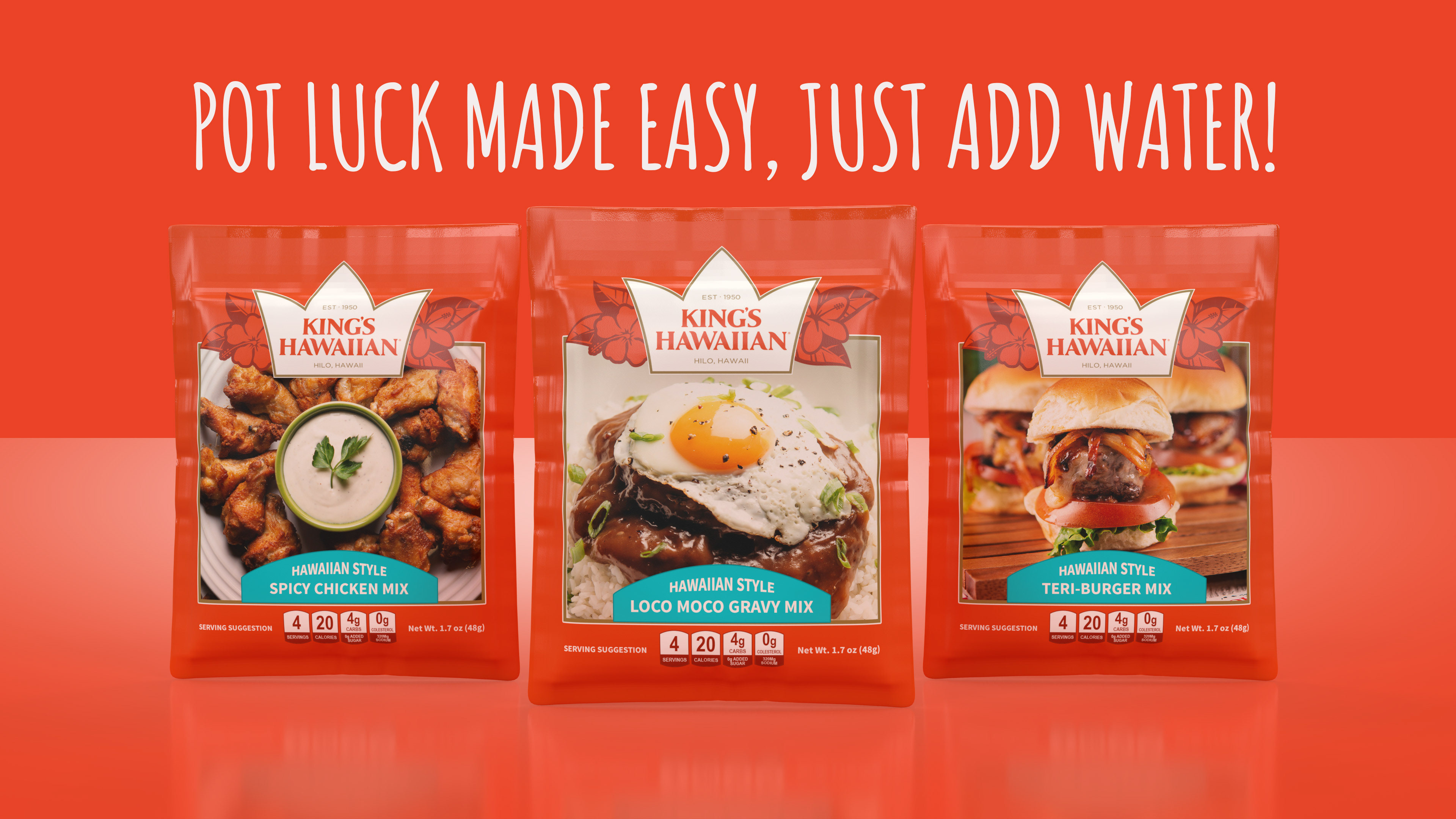
Objective: Extend the visual equity of King’s Hawaiian rolls into a convenient recipe mix line.
Solution: Designed a cohesive packaging and brand concept that mirrors recognizable color, typography, and island-inspired cues from the existing product family. The result creates a strong shelf connection, simplifies meal planning, and positions the mixes as easy add-ons for complete Hawaiian-style recipes.
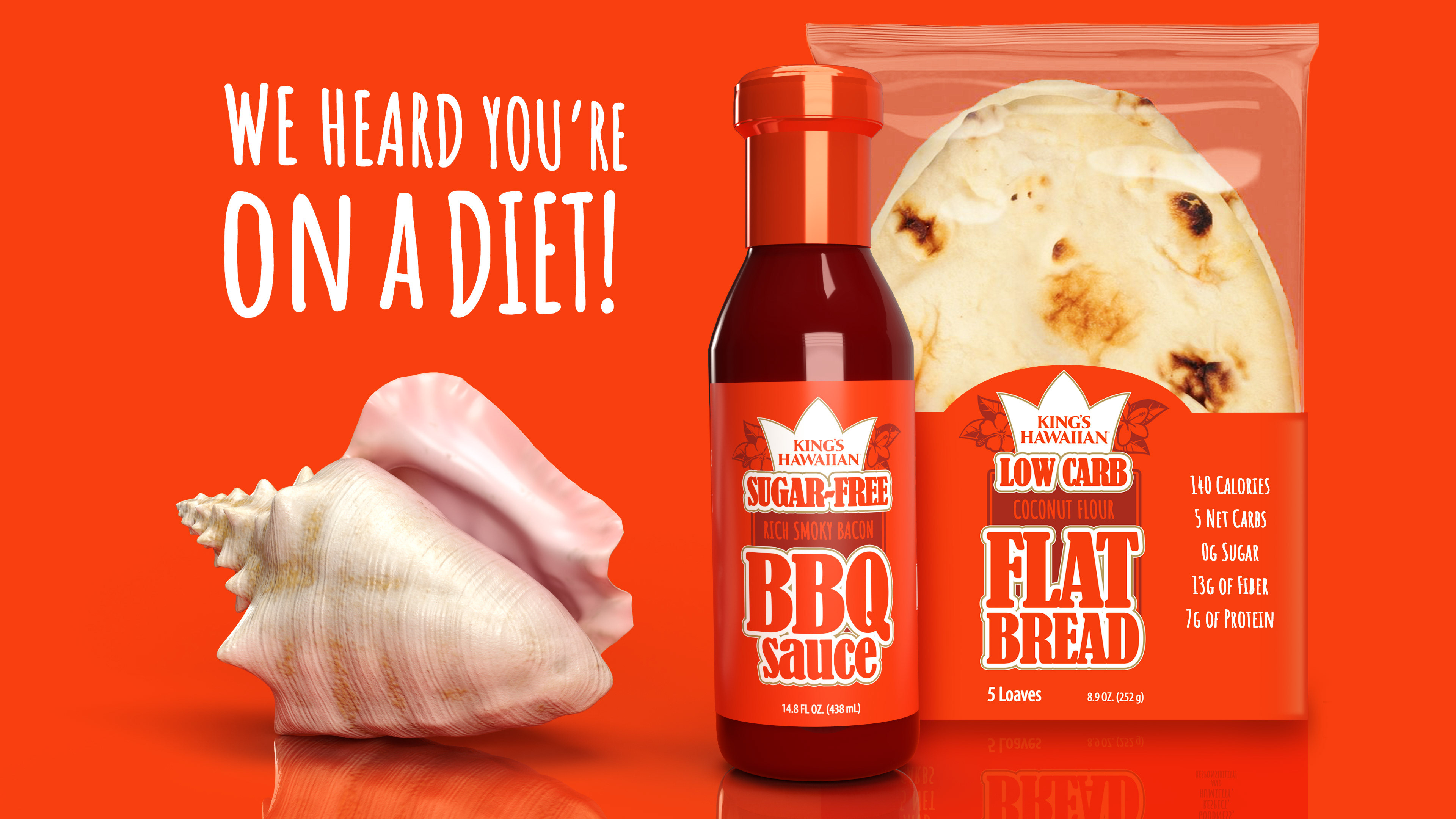
Objective: Explore how a heritage food brand could expand into better-for-you CPG products without losing visual recognition.
Solution: Designed a cohesive sugar-free and low-carb product concept that mirrors familiar King’s Hawaiian-style brand cues while introducing new dietary-focused offerings. The concept supports portfolio expansion, clearer shelf blocking, and stronger relevance with consumers seeking lower-sugar and lower-carb meal options.
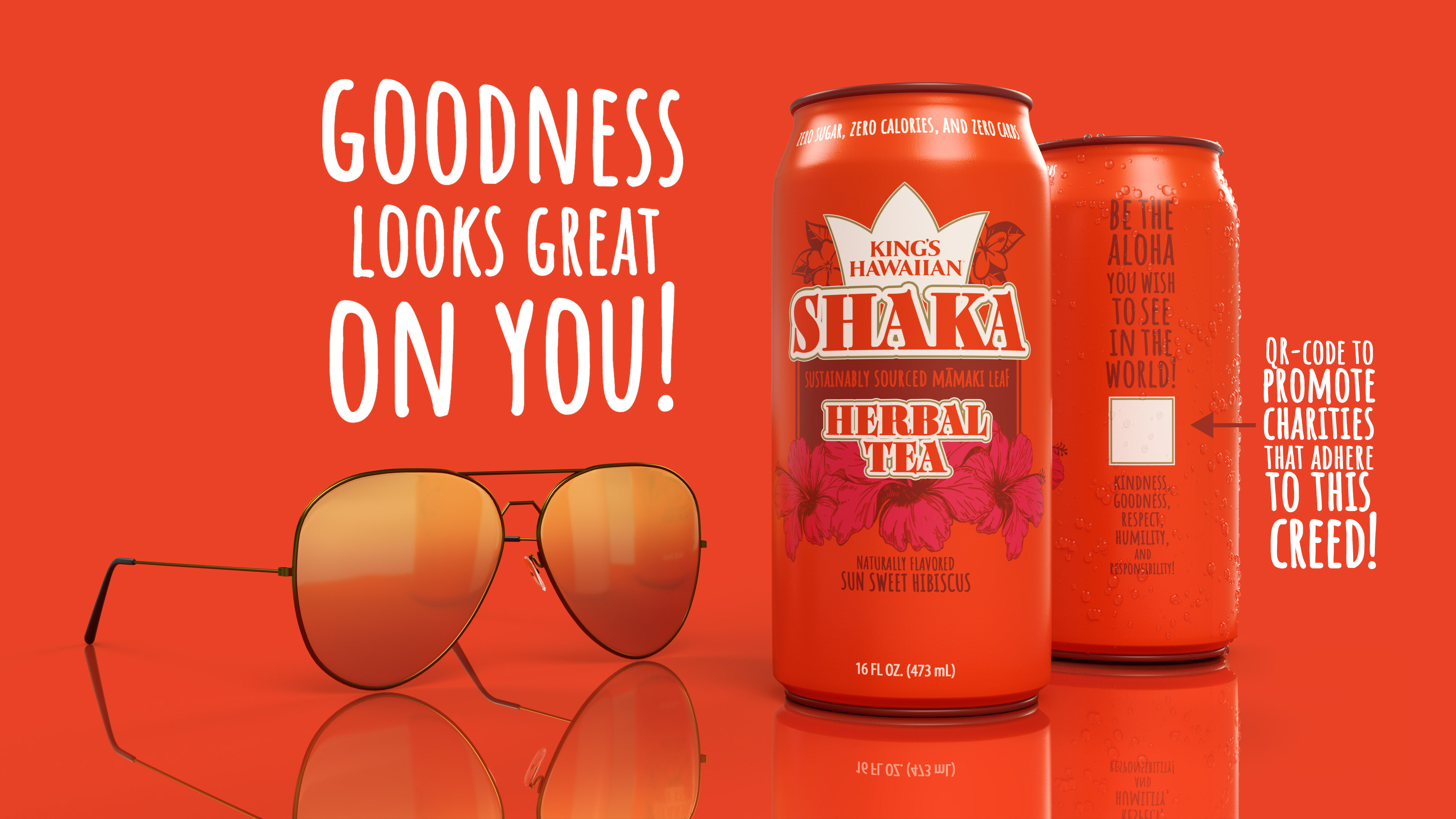
Objective: Explore how two island-inspired food and beverage brands could merge into a purpose-driven CPG concept.
Solution: Designed a co-branded herbal tea concept that blends recognizable tropical brand cues with a charity-focused engagement system. The packaging uses vibrant color, uplifting copy, and QR-code activation to create a delicious, mission-driven product experience that encourages consumers to “drink good” while doing good.
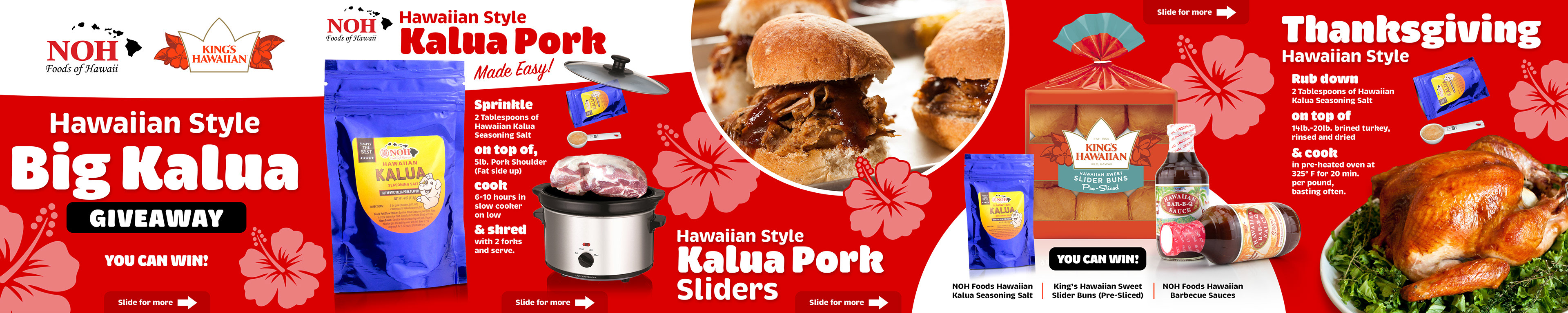

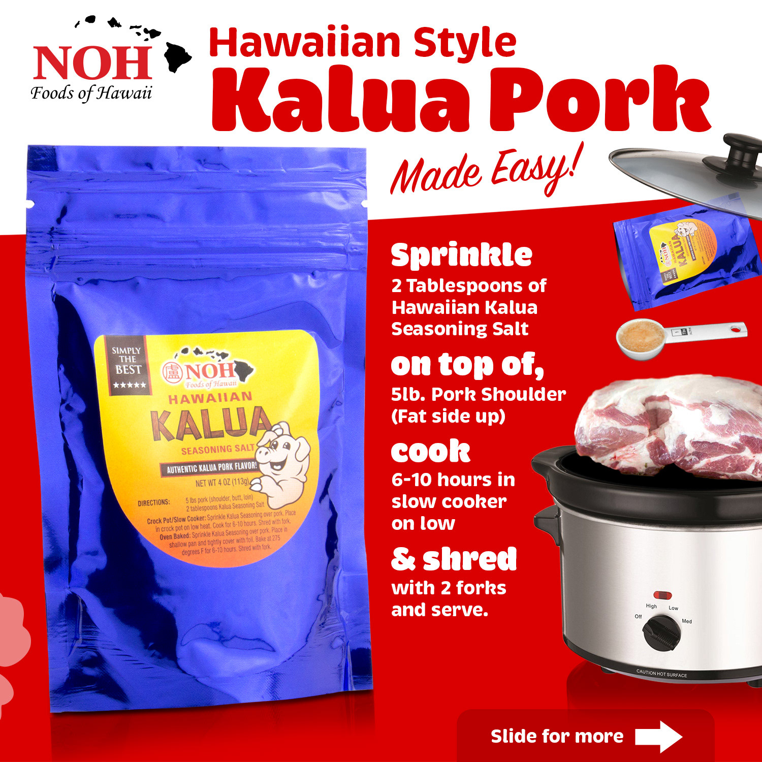
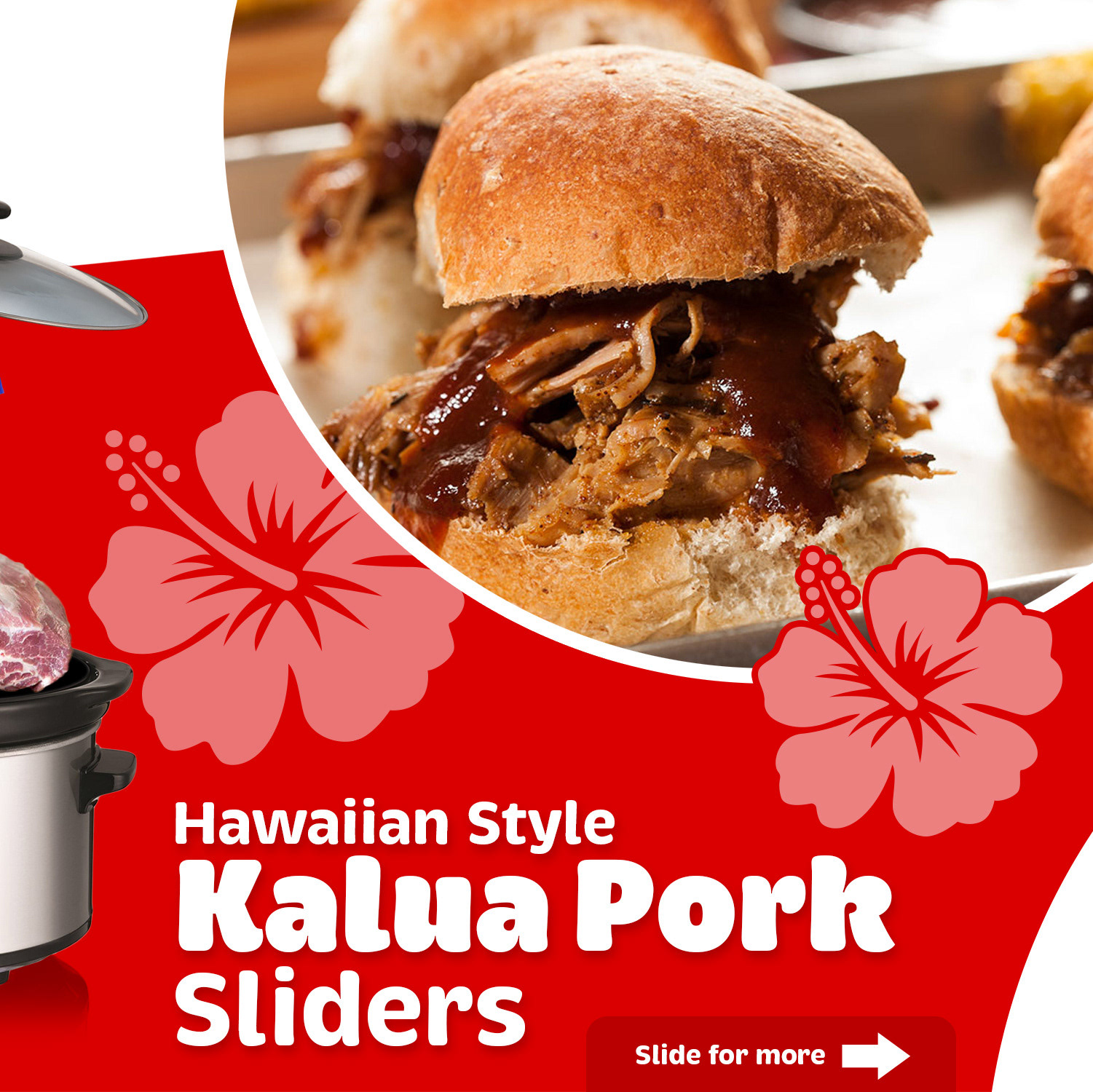
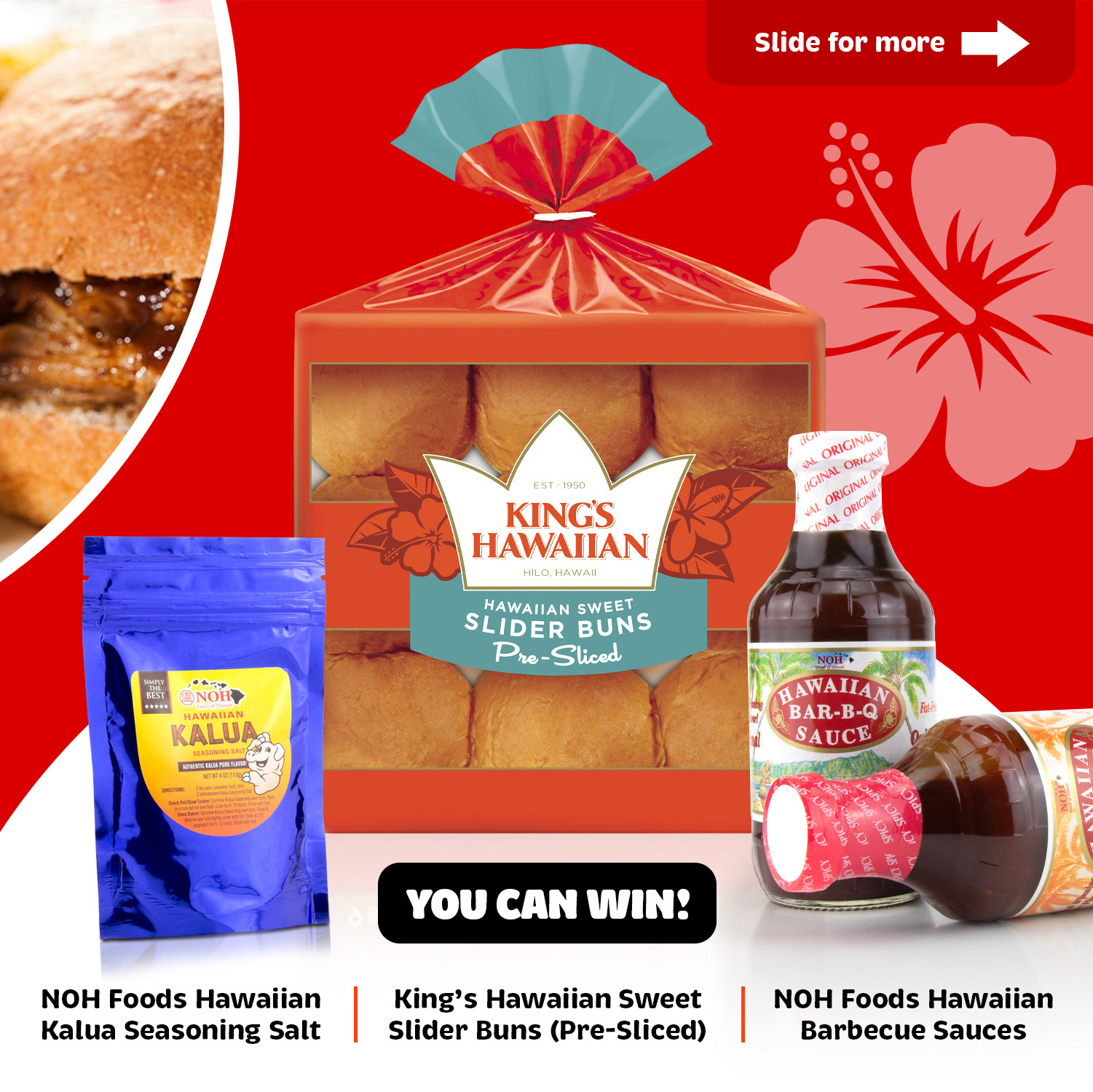
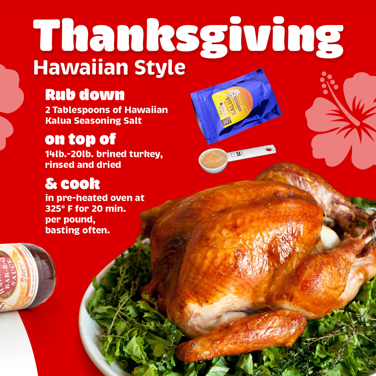
Instagram Giveaway Carousel Campaign
Designed a multi-slide Instagram giveaway campaign connecting NOH Foods of Hawaii with King’s Hawaiian through an easy Hawaiian-style Kalua Pork meal concept. The carousel uses bold red branding, tropical floral graphics, step-by-step recipe storytelling, and clear “slide for more” prompts to drive engagement and encourage users to explore the full product bundle. The campaign was built to support social growth, cross-brand awareness, recipe education, and consumer trial through an approachable Thanksgiving and entertaining-focused promotion.

Objective: Drive local store visits and coupon redemption through a high-impact direct mail placement.
Solution: Developed a visually indulgent Cold Stone Creamery ad with a strong seasonal headline, large product hero image, clear location messaging, and multiple promotional offers. The design balances brand presentation with direct-response marketing to encourage immediate consumer action.
This rebrand transformed a traditional Korean hot sauce into a modern consumer brand optimized for today's retail environment. The project included brand strategy, packaging redesign, visual identity development, and shelf-impact optimization. The resulting system created a more distinctive brand presence, improved product navigation, and established a scalable foundation for future SKU expansion.
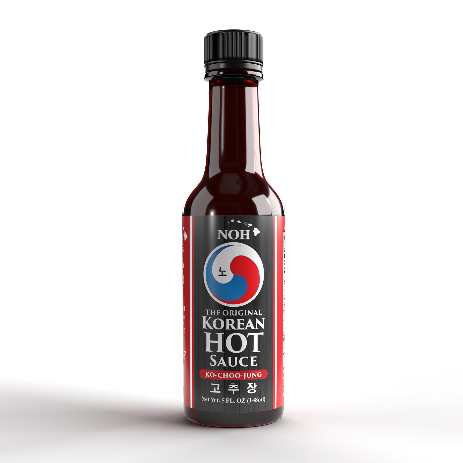
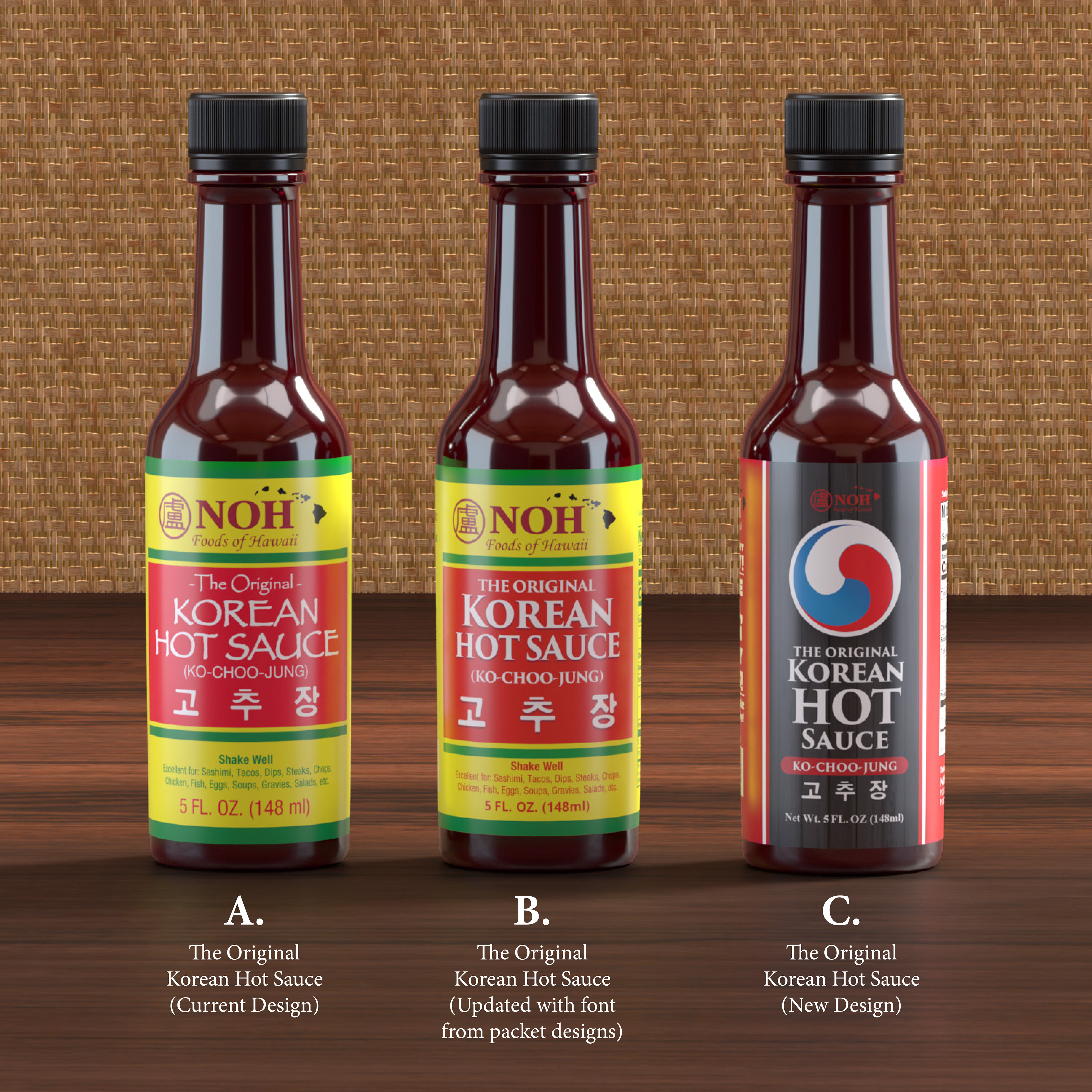
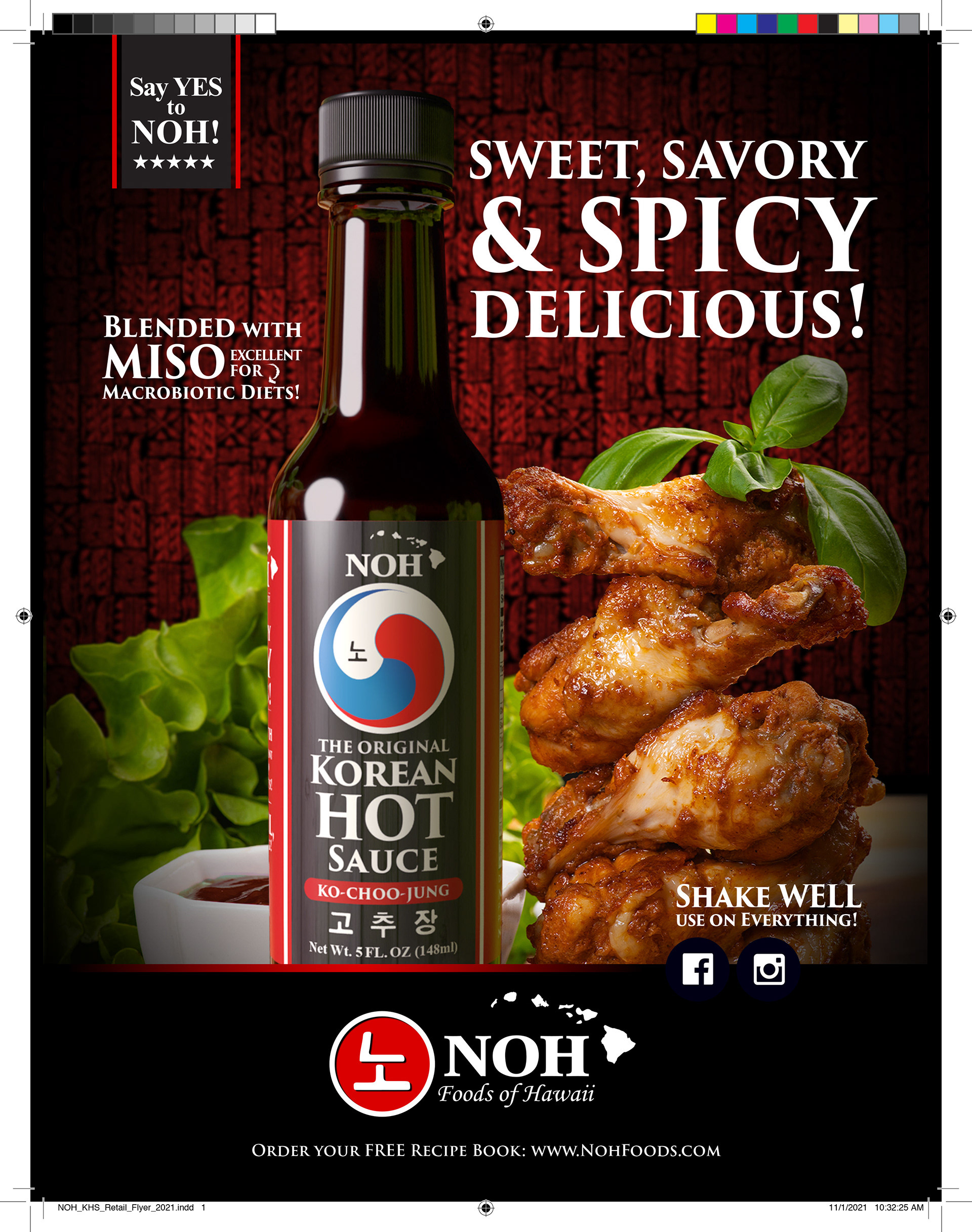
Korean Hot Sauce Packaging Redesign
Developed a refreshed packaging system for NOH's Korean Hot Sauce line, designed to strengthen shelf visibility, improve consumer recognition, and better communicate product authenticity. The redesign leverages bold Korean-inspired visual cues, clear product hierarchy, and a premium color palette to create stronger differentiation within the competitive hot sauce category. The updated packaging establishes a scalable foundation for future flavor extensions while reinforcing the brand's heritage and credibility.
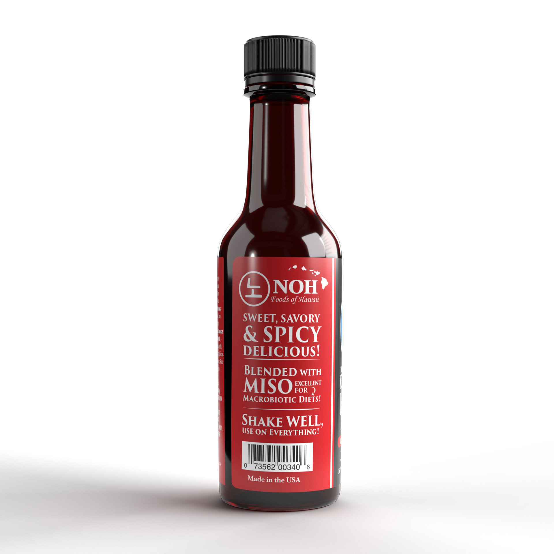
The packaging copy was restructured to emphasize consumer benefits over product features, creating a stronger retail communication hierarchy. Flavor descriptors, ingredient callouts, and usage cues work together to increase product understanding, improve shopper engagement, and encourage trial among consumers unfamiliar with Korean-style sauces.
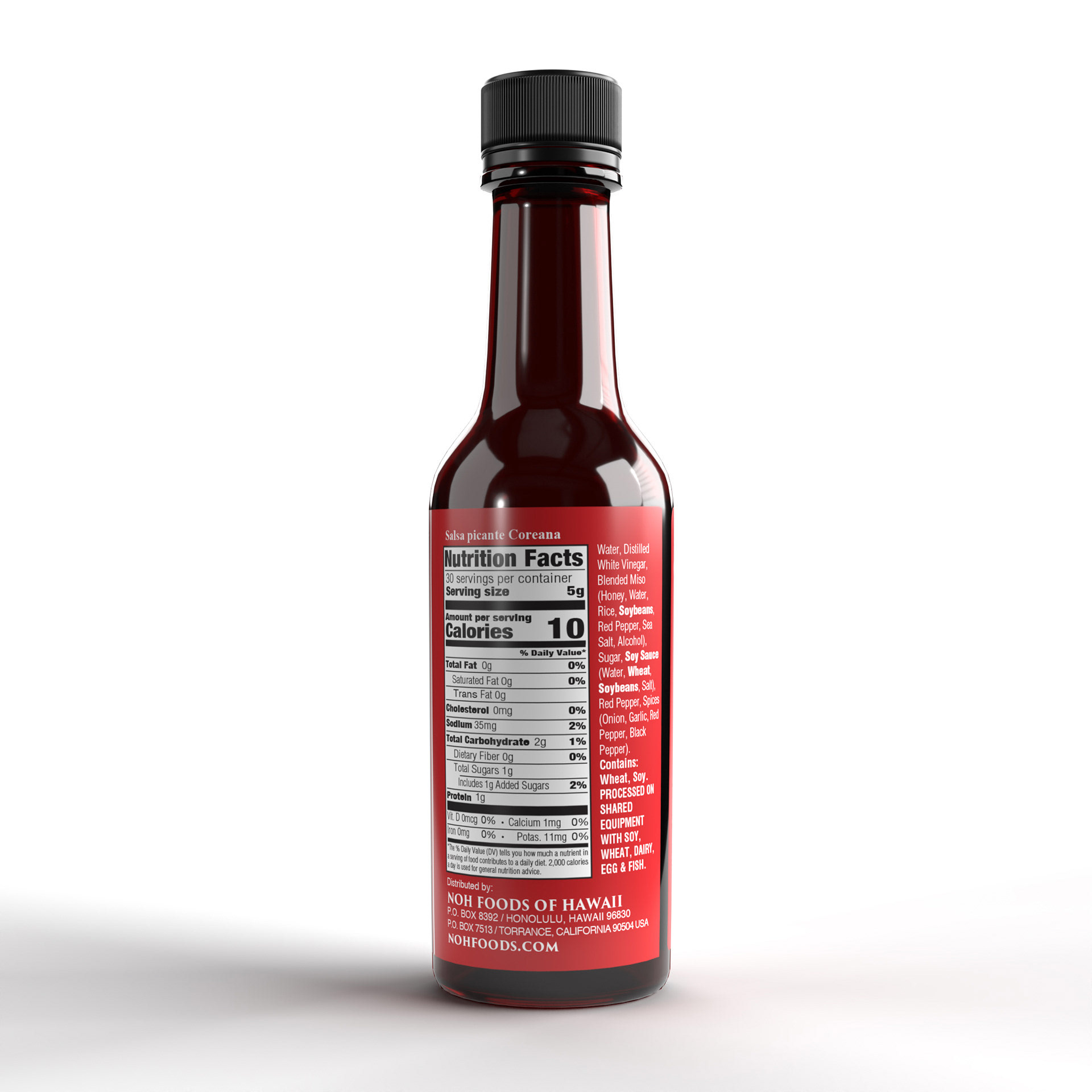
The information panel was redesigned to improve readability, support FDA labeling requirements, and create a more organized consumer experience. Careful attention to typography, spacing, and information hierarchy allows essential product details to remain accessible while preserving the premium appearance of the overall package design.
Objective: Support retail expansion and increase buyer interest in NOH's Korean Hot Sauce.
Solution: Developed a sales-driven marketing slick featuring strong product imagery, appetite appeal, flavor-forward messaging, and clear branding. The piece was designed for retailer presentations, trade marketing initiatives, and merchandising programs to help communicate product benefits and strengthen market positioning.
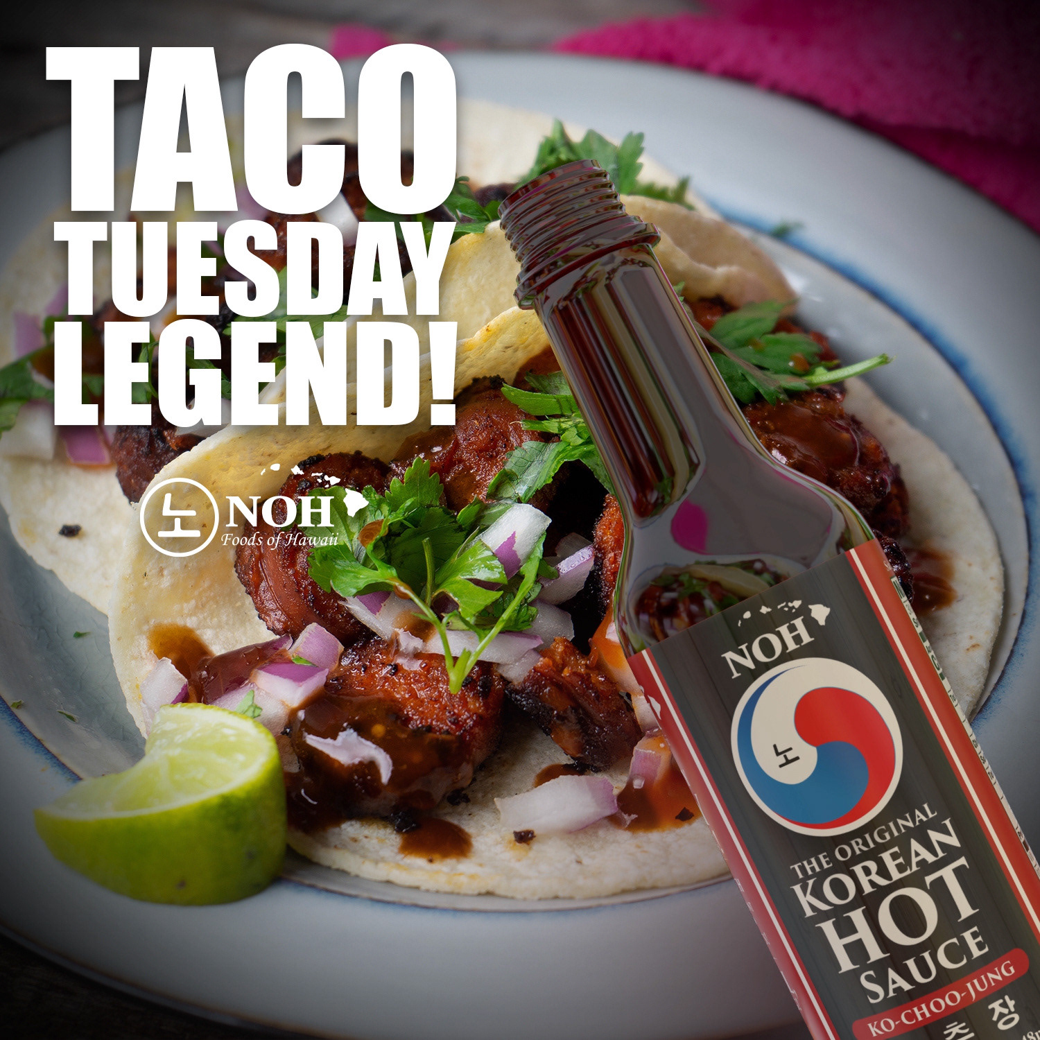
Social Media Campaign Design
Created a bold, appetite-driven social media graphic for NOH Korean Hot Sauce designed to increase engagement around Taco Tuesday. The post combines high-impact food photography, oversized promotional typography, and strong product placement to connect the sauce with an approachable, everyday meal occasion while reinforcing brand recognition and flavor versatility.
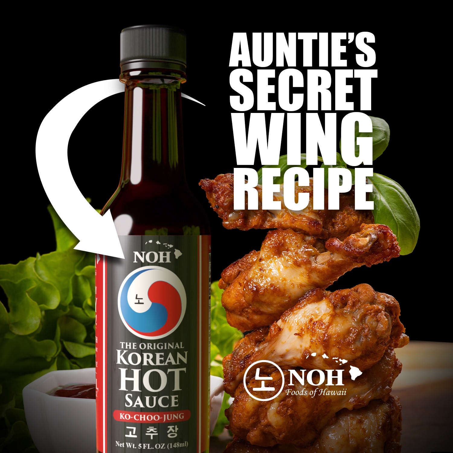
Designed a high-impact social media post positioning NOH Korean Hot Sauce as the secret ingredient for craveable wings. Bold typography, appetite-driven imagery, and prominent product placement work together to drive engagement, brand recognition, and everyday recipe inspiration.
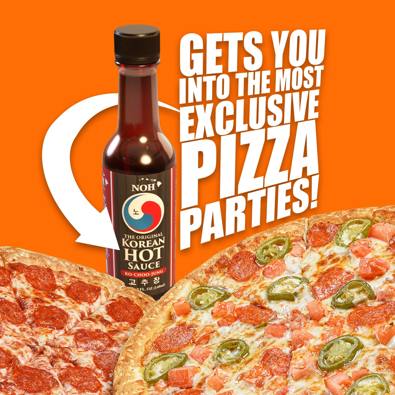
Designed a high-energy social media post positioning NOH Korean Hot Sauce as a bold flavor upgrade for pizza nights and casual gatherings. Strong typography, vibrant color, and prominent product placement create a scroll-stopping visual built for engagement and brand recognition.
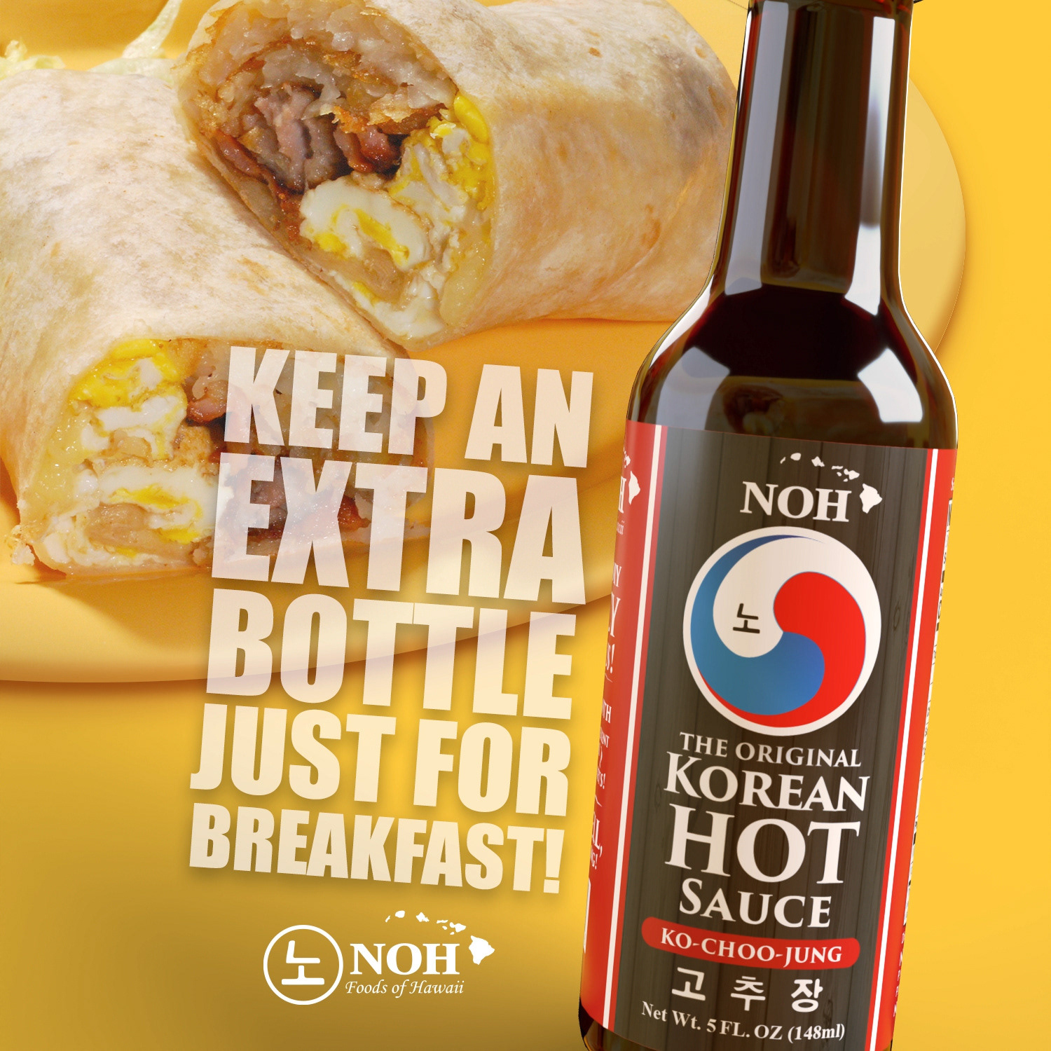
Created a breakfast-focused social media graphic for NOH Korean Hot Sauce designed to expand product usage beyond lunch and dinner occasions. The layout pairs bright morning-inspired color, bold promotional typography, and strong product placement with familiar breakfast imagery to position the sauce as an everyday flavor enhancer for burritos, eggs, and grab-and-go meals.
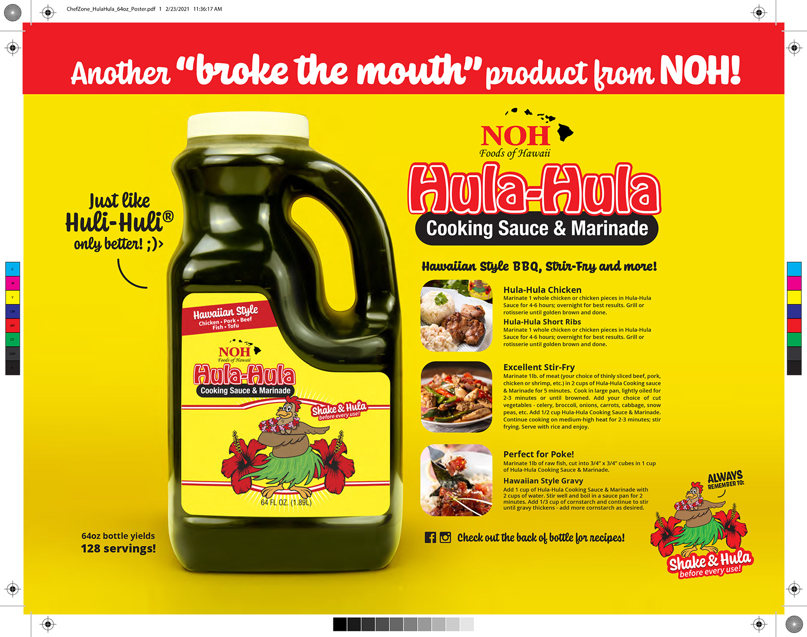
Objective: Support wholesale adoption of NOH Hula-Hula Cooking Sauce & Marinade through clear food service messaging.
Solution: Developed a bright, attention-grabbing poster for Chef Zone that emphasizes product yield, recipe versatility, and commercial kitchen applications. Strong product photography, bold typography, and usage callouts help communicate value to chefs, buyers, and food service operators.
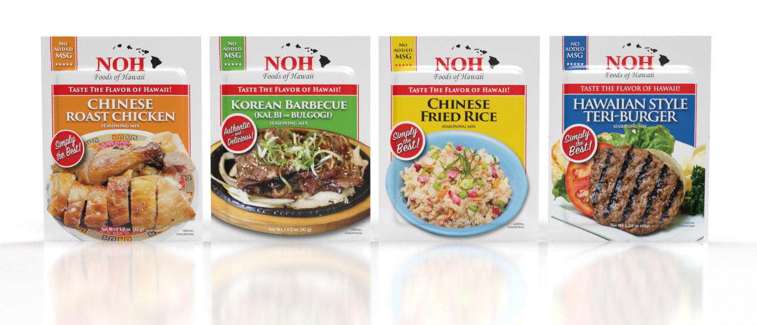
Objective: Modernize a large seasoning mix portfolio while maintaining brand recognition across existing retail channels.
Solution: Developed a scalable packaging system for 20+ SKUs with improved visual hierarchy, consistent branding, clearer flavor communication, and stronger food photography. The redesign helped unify the product line, simplify shopper navigation, and strengthen shelf presence across multiple categories.
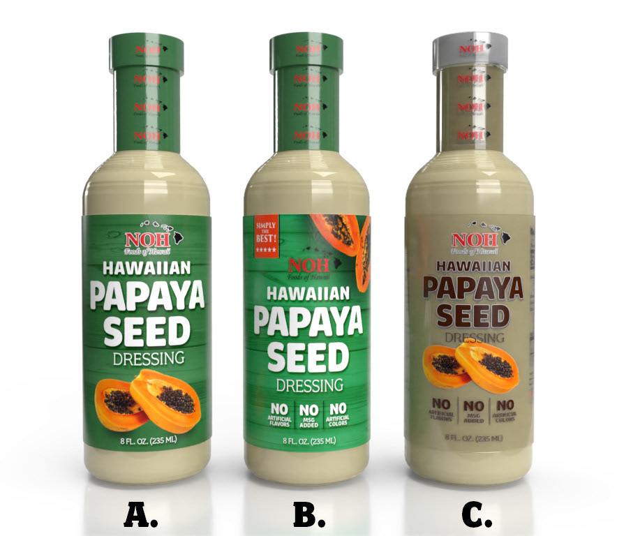
Explored three front-label directions for NOH Hawaiian Papaya Seed Dressing, each designed to evaluate shelf impact, flavor communication, and brand recognition.
A. Bold, approachable direction using strong green color blocking, large product typography, and clear papaya imagery to emphasize freshness and flavor at shelf.
B. A more retail-driven concept with stronger hierarchy, benefit callouts, and “Simply the Best” positioning to communicate quality, clean-label attributes, and consumer appeal.
C. Premium, transparent-label approach that lets the product color become part of the design while using refined typography and fruit imagery to create a lighter, more upscale presentation.
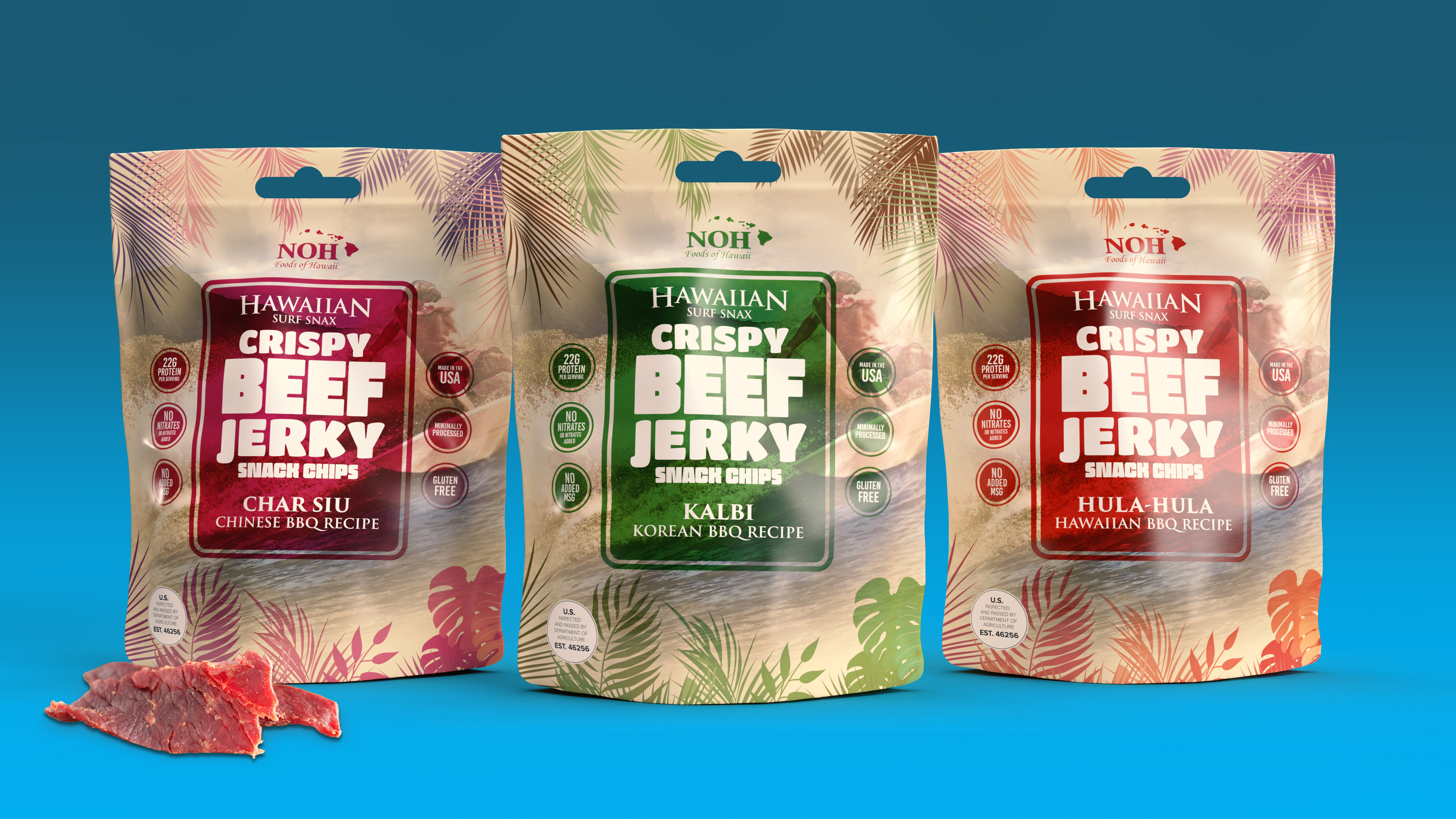
Developed a tropical-inspired beef jerky packaging concept designed to position the product as a flavorful Hawaiian snack with strong retail shelf appeal. The design uses soft island graphics, bold flavor blocking, and clear product benefit callouts to communicate protein content, clean-label attributes, and regional flavor inspiration while creating a cohesive family look across Kalbi, Char Siu, and Hula-Hula BBQ varieties.
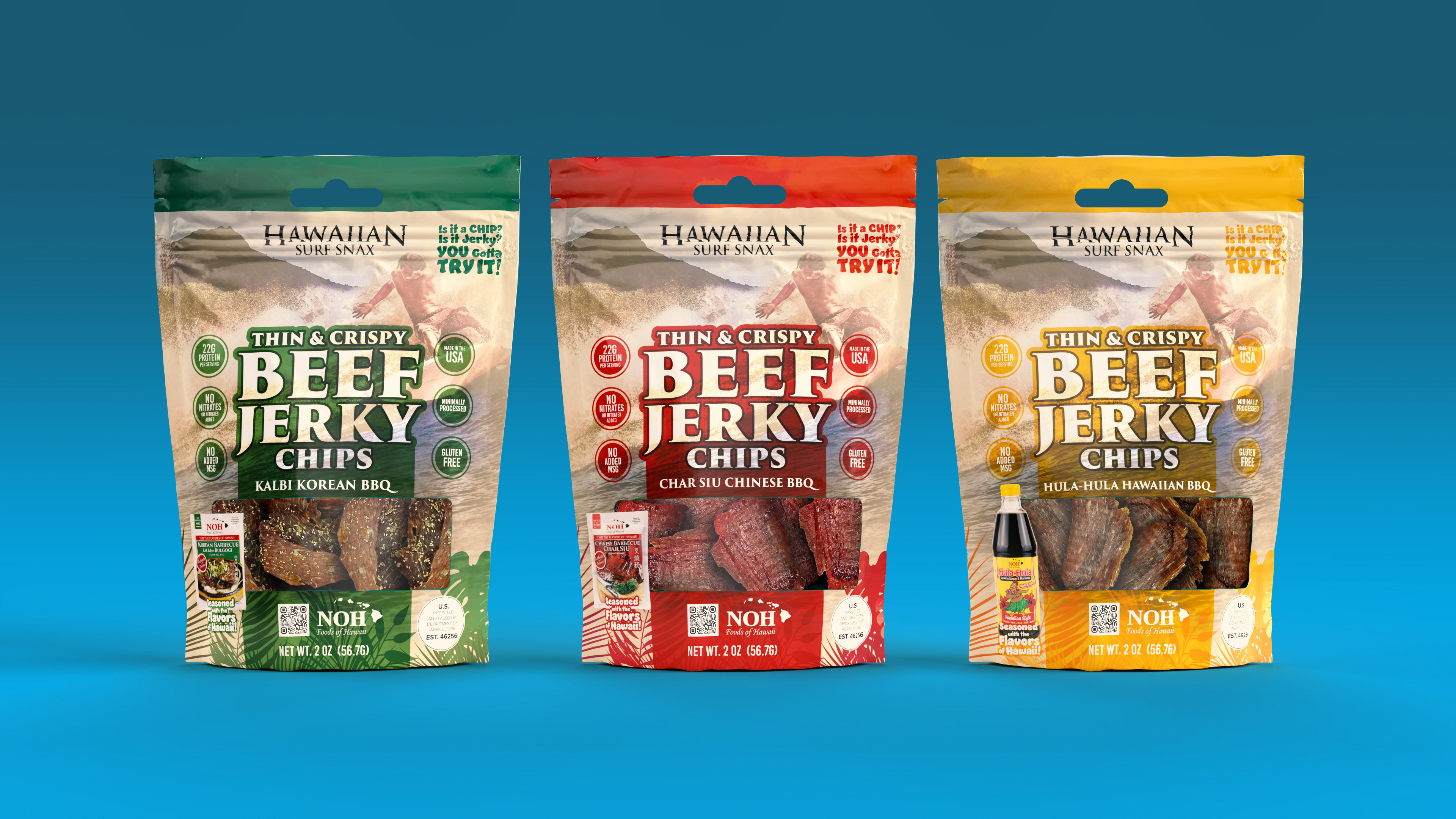
Created a more energetic snack-focused packaging system for thin and crispy beef jerky chips, designed to bridge traditional jerky with the visual language of chips and grab-and-go snacks. The concept emphasizes bold typography, transparent product windows, flavor-specific color coding, and benefit-driven claims to improve shop-ability, highlight product texture, and support stronger impulse purchase at retail.
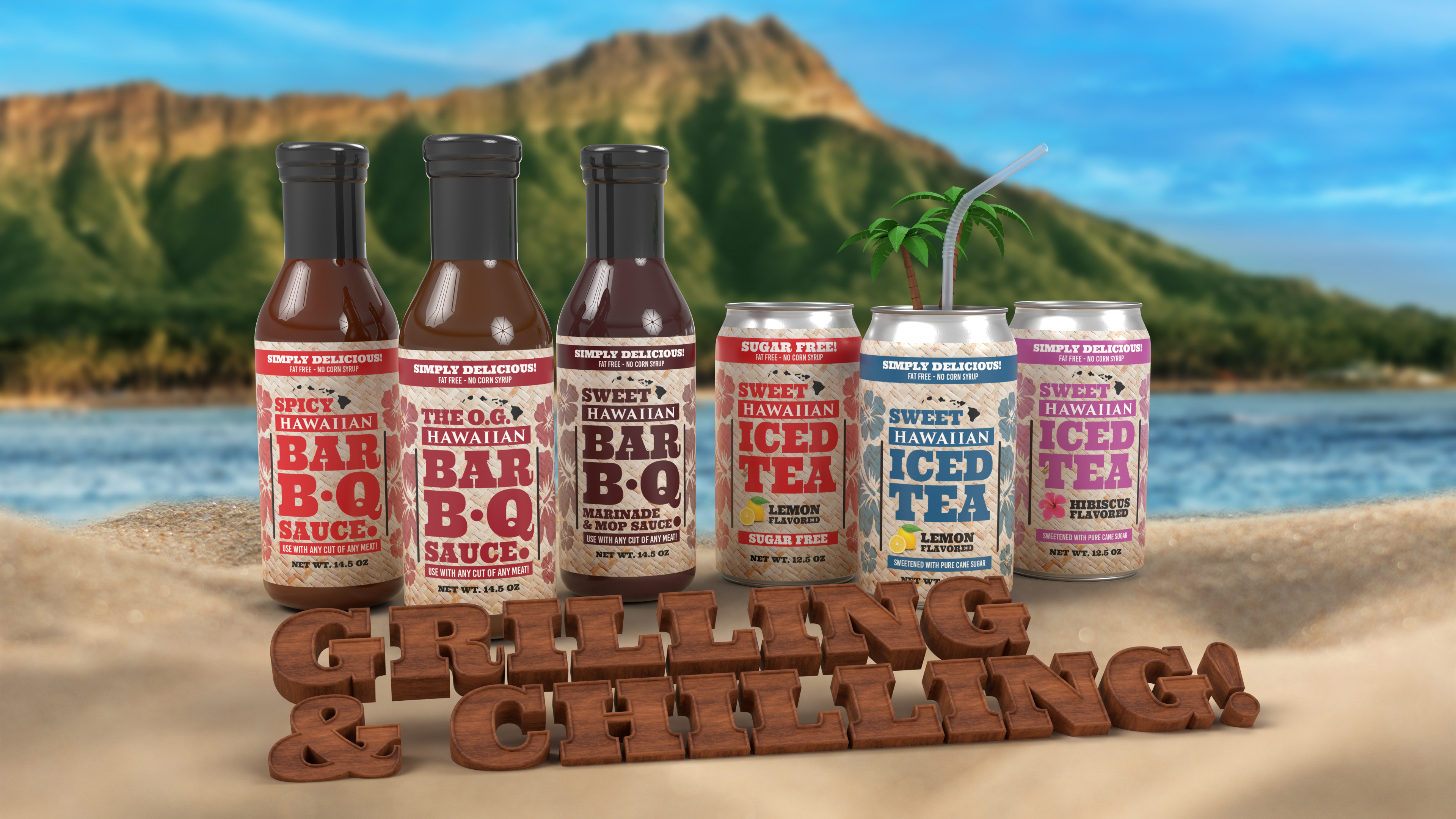
Objective: Expand the brand into a lifestyle-oriented summer product line that connects food and beverage occasions.
Solution: Designed a coordinated “Grillin’ & Chillin’” line extension featuring Hawaiian-style BBQ sauces and iced teas. The packaging system uses shared visual language, tropical patterns, and bold product storytelling to create a unified family look that encourages meal pairing, seasonal merchandising, and stronger consumer engagement.
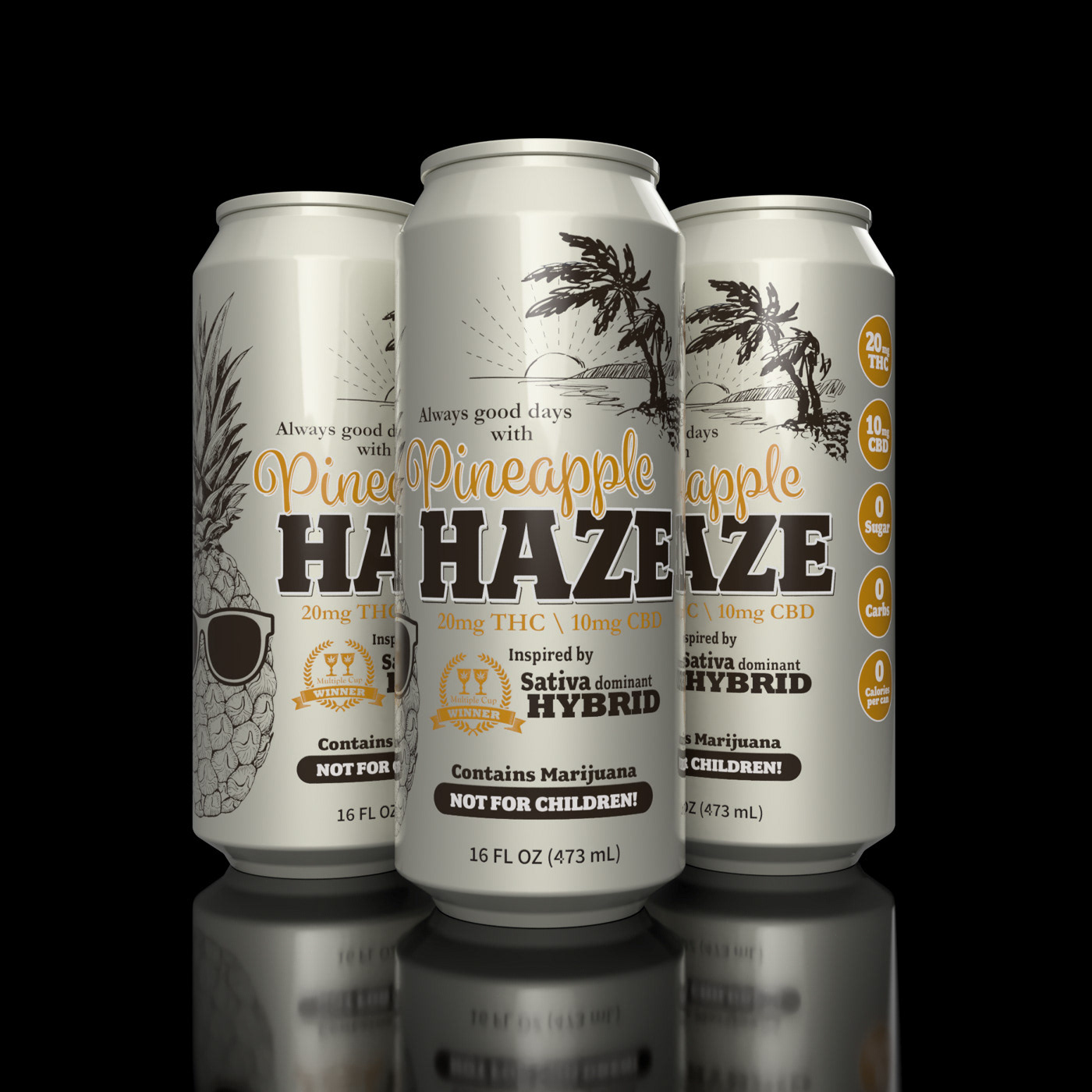
Objective: Create a cannabis beverage concept that feels approachable, tropical, and lifestyle-driven while clearly communicating THC/CBD content.
Solution: Designed a 16 oz Pineapple Haze can system featuring island-inspired illustration, bold product naming, dosage callouts, and compliant adult-use messaging. The result positions the beverage as a premium infused refreshment with strong flavor appeal and clear shelf communication.